
Rebranding OKC’s Largest Locally Owned Grocer

Challenge
Homeland needed a refreshed identity that reflected Oklahoma pride while clearly communicating value to customers. At the same time, its multi-tiered pricing program created confusion at shelf, requiring a simplified, impactful communication system.
Solution
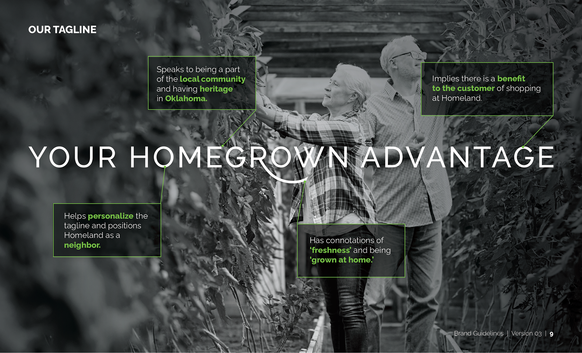
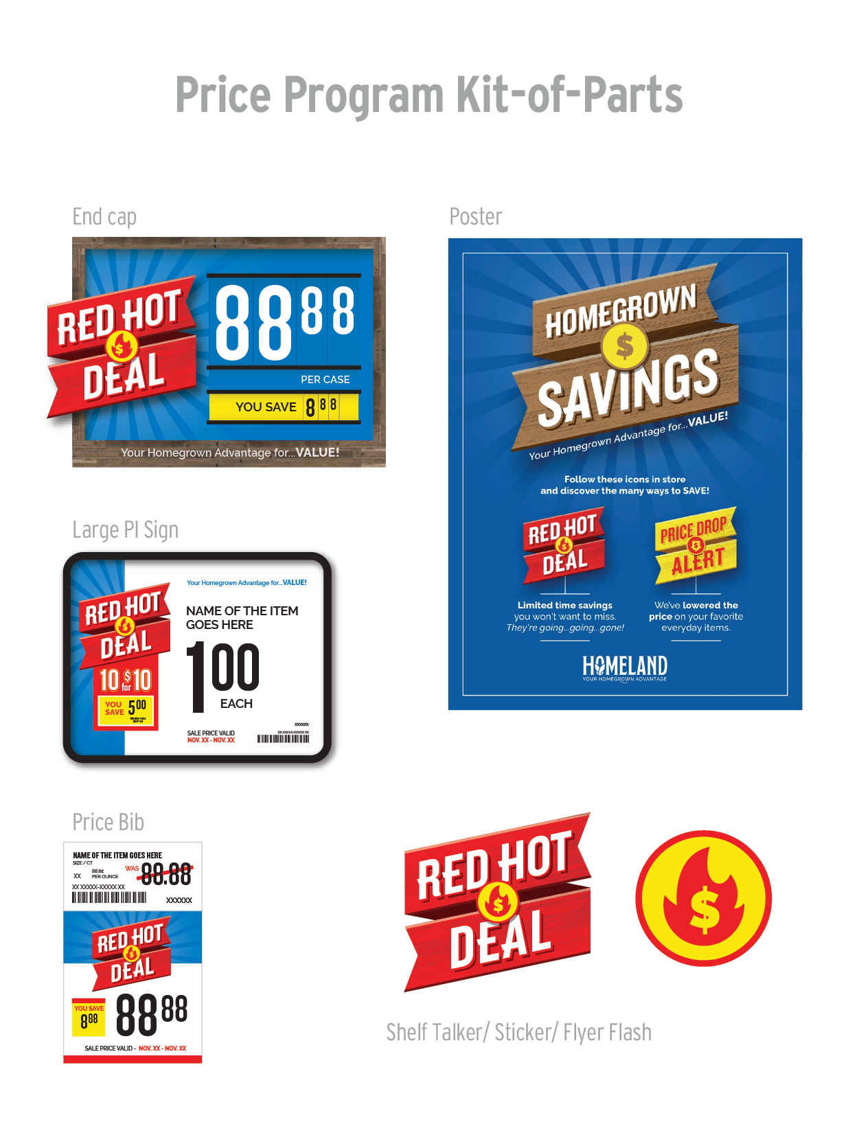
As ACD at Rodmell & Company, I led the Homeland rebrand—designing a heritage-inspired logo, simplifying the pricing structure into two clear categories—Red Hot Deals for promotions and Price Drop Alert for everyday value—and directing in-store signage to reinforce both identity and clarity. The cohesive system reinforced Homeland’s fresh, local offerings while enhancing the overall customer experience.
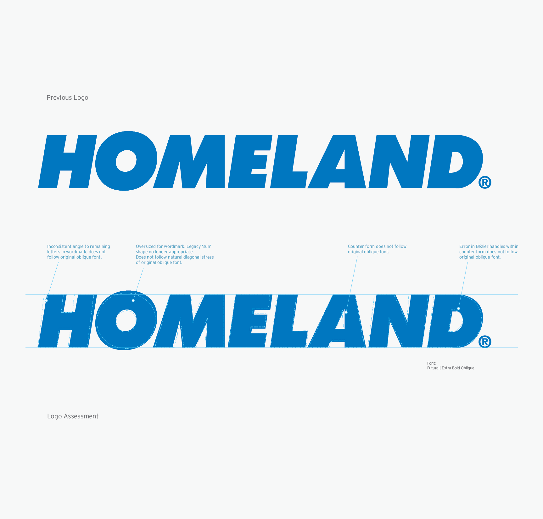
Previous Logo

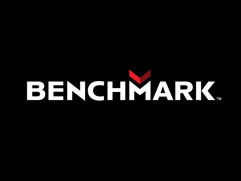
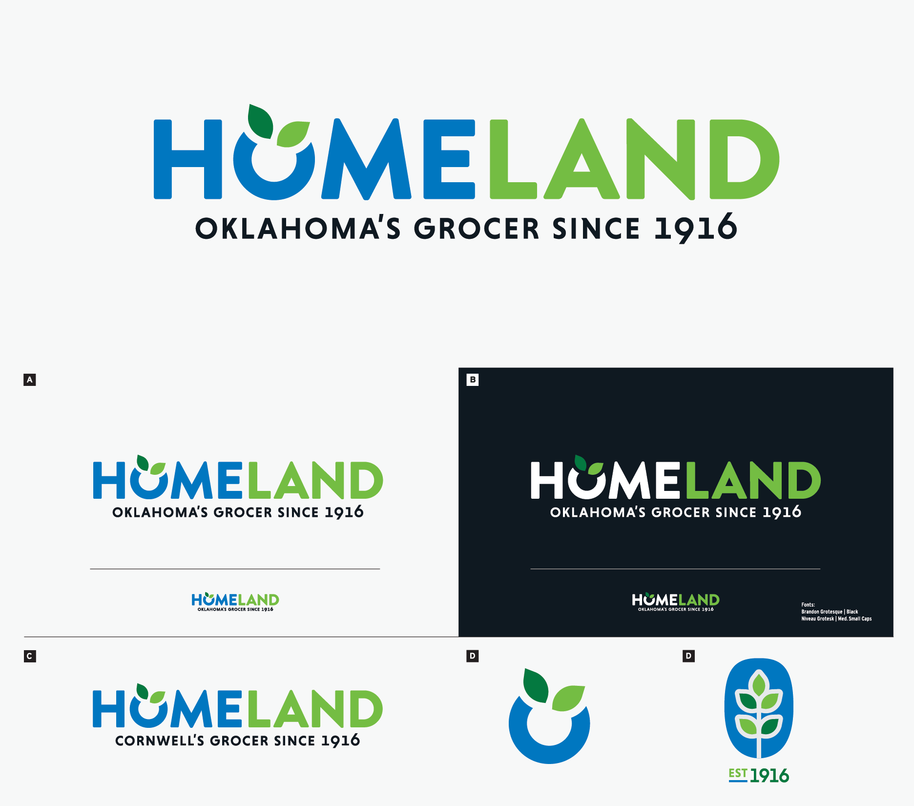
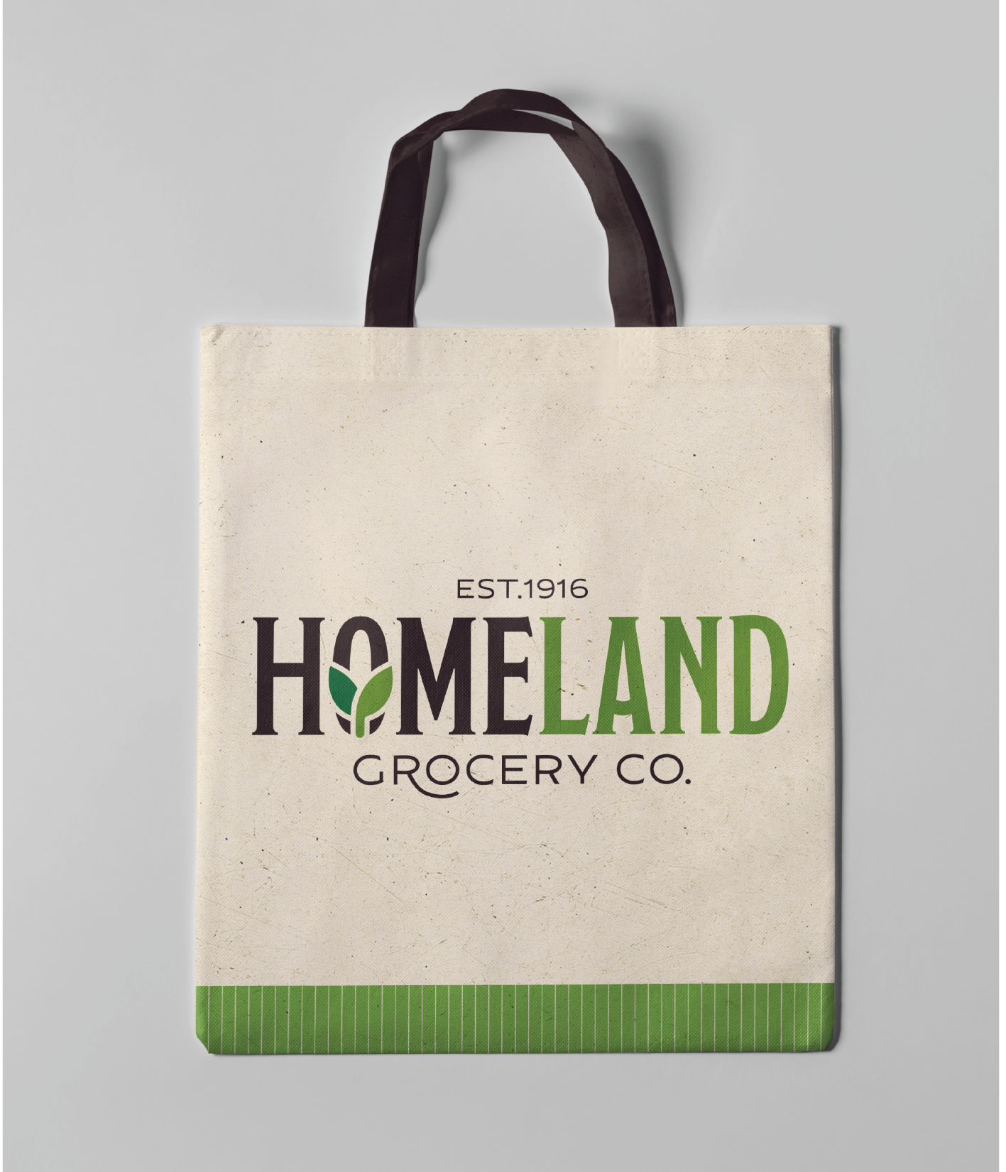
Final Rebrand
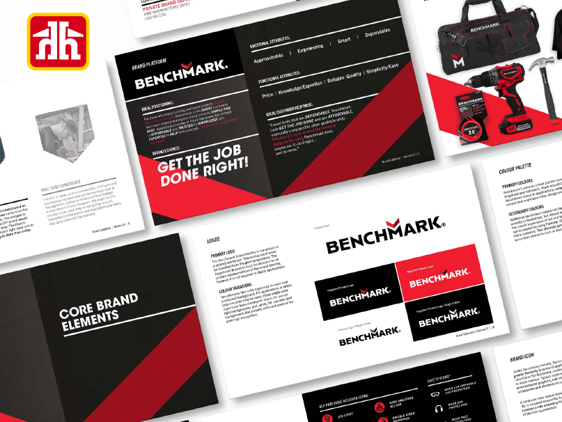
Identity Concepts
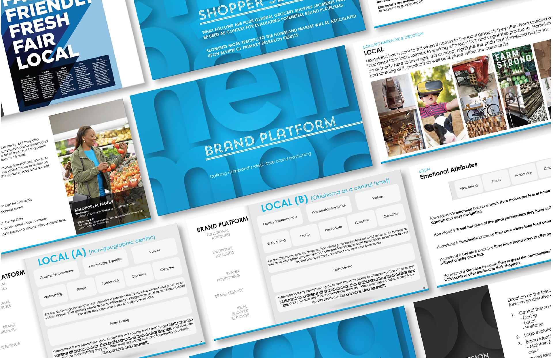
Started with Brand Strategy
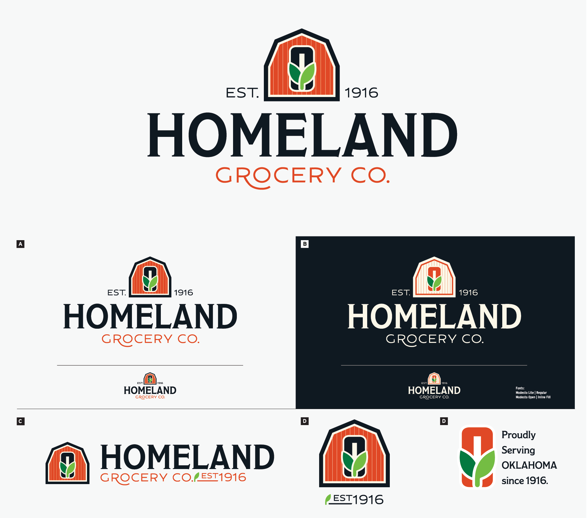
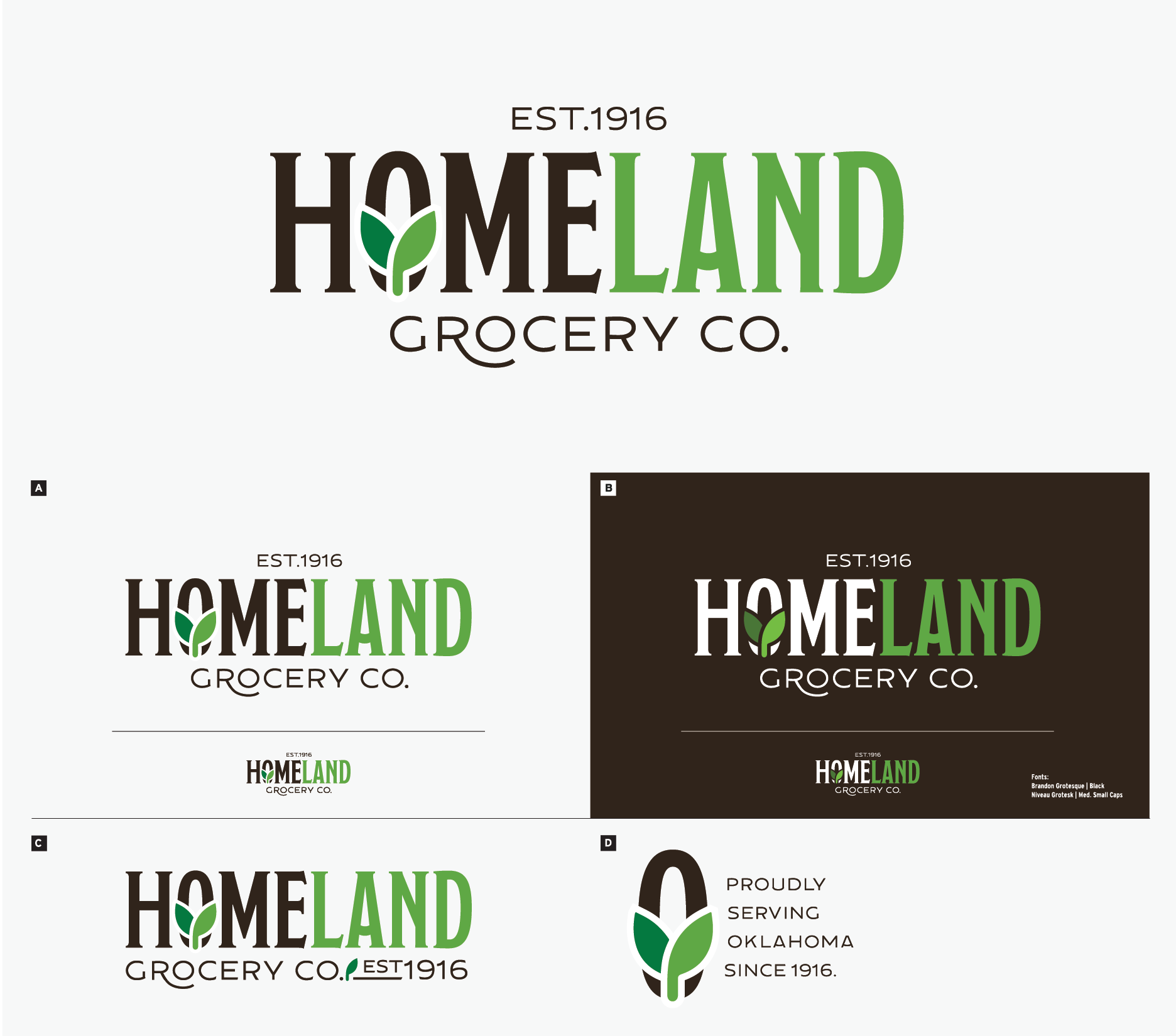
Form & Elements Discovered
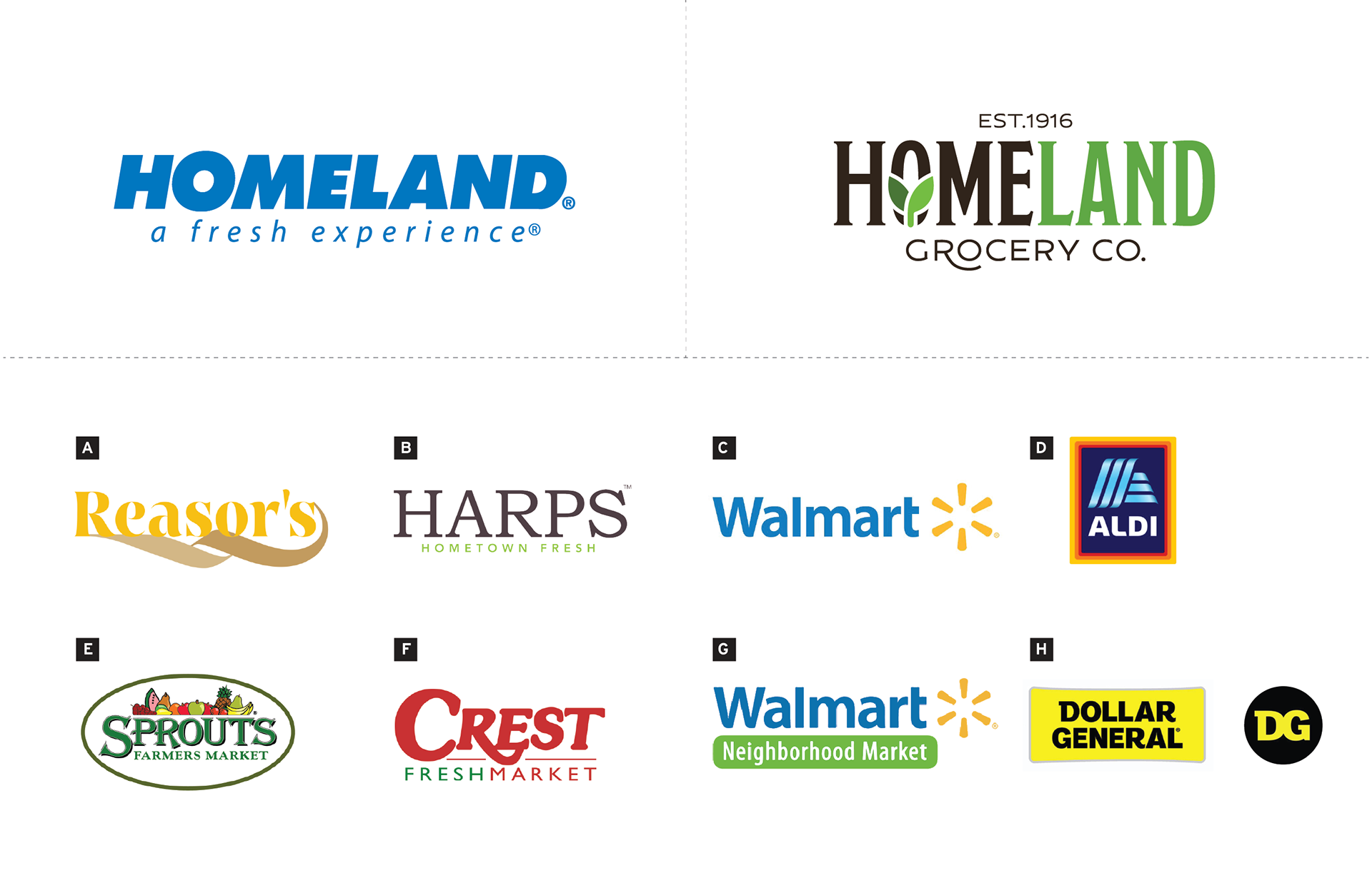
Visual Comparison VS Competitive Set
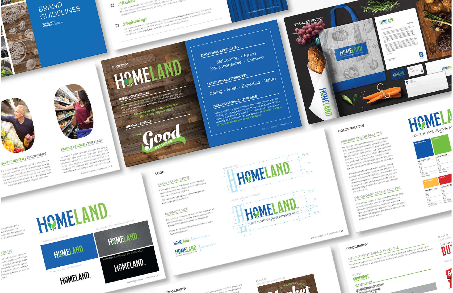
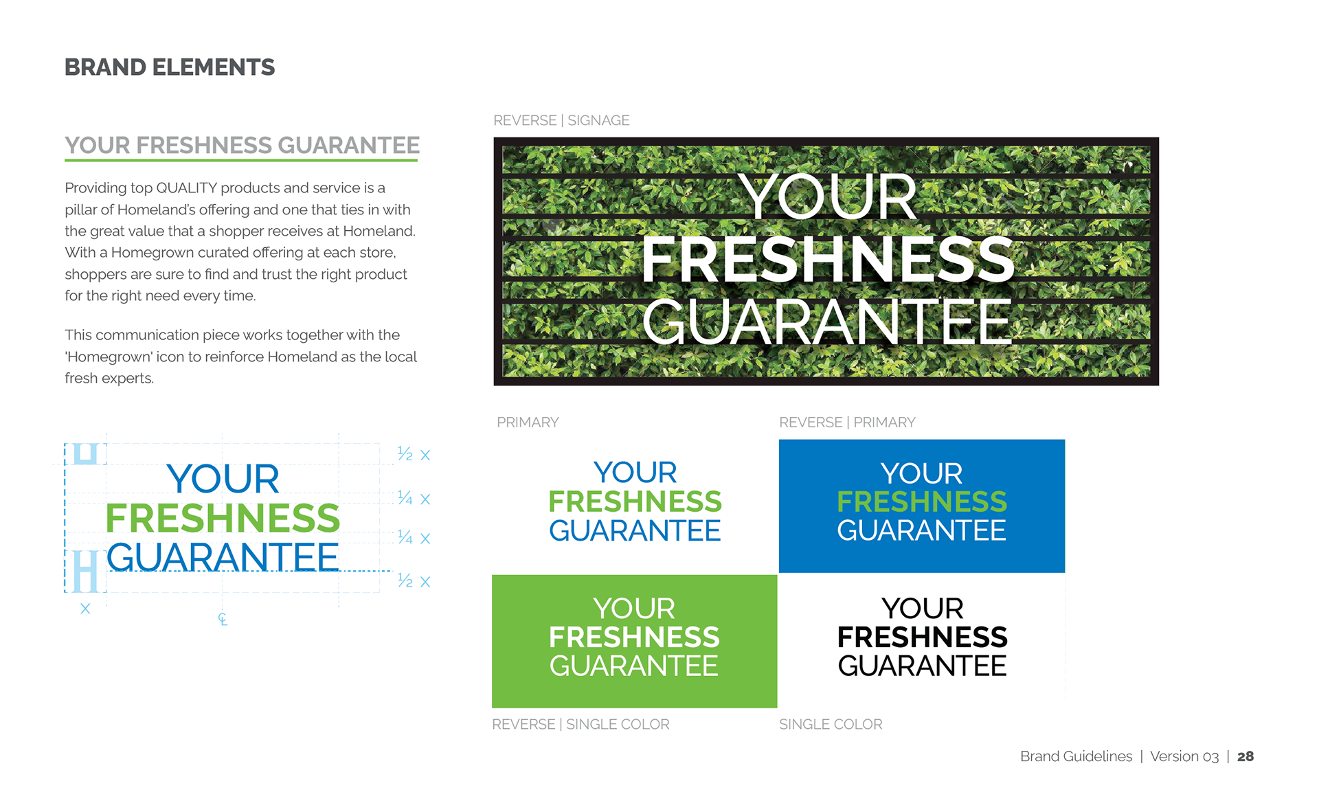
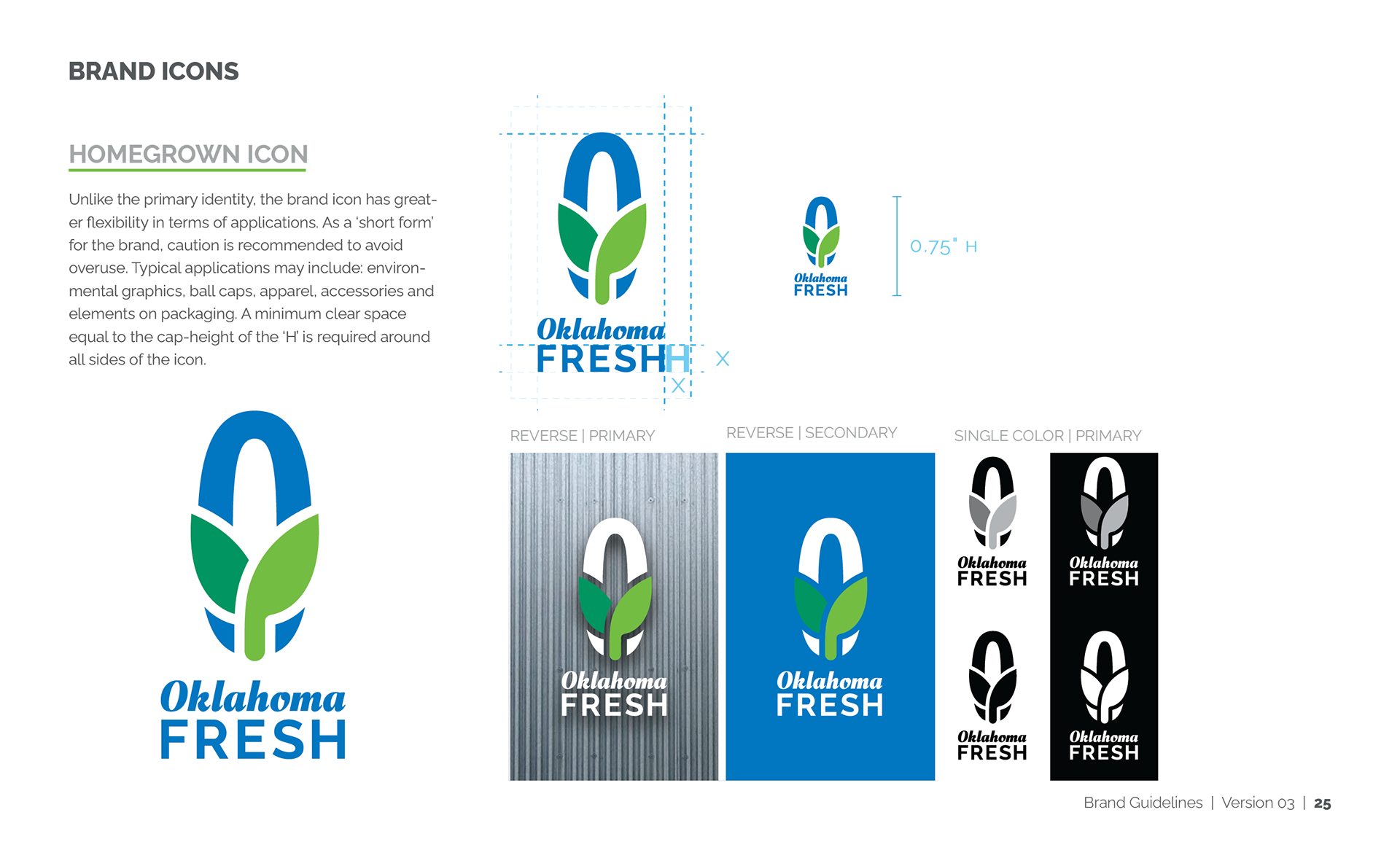
Brand Guidelines
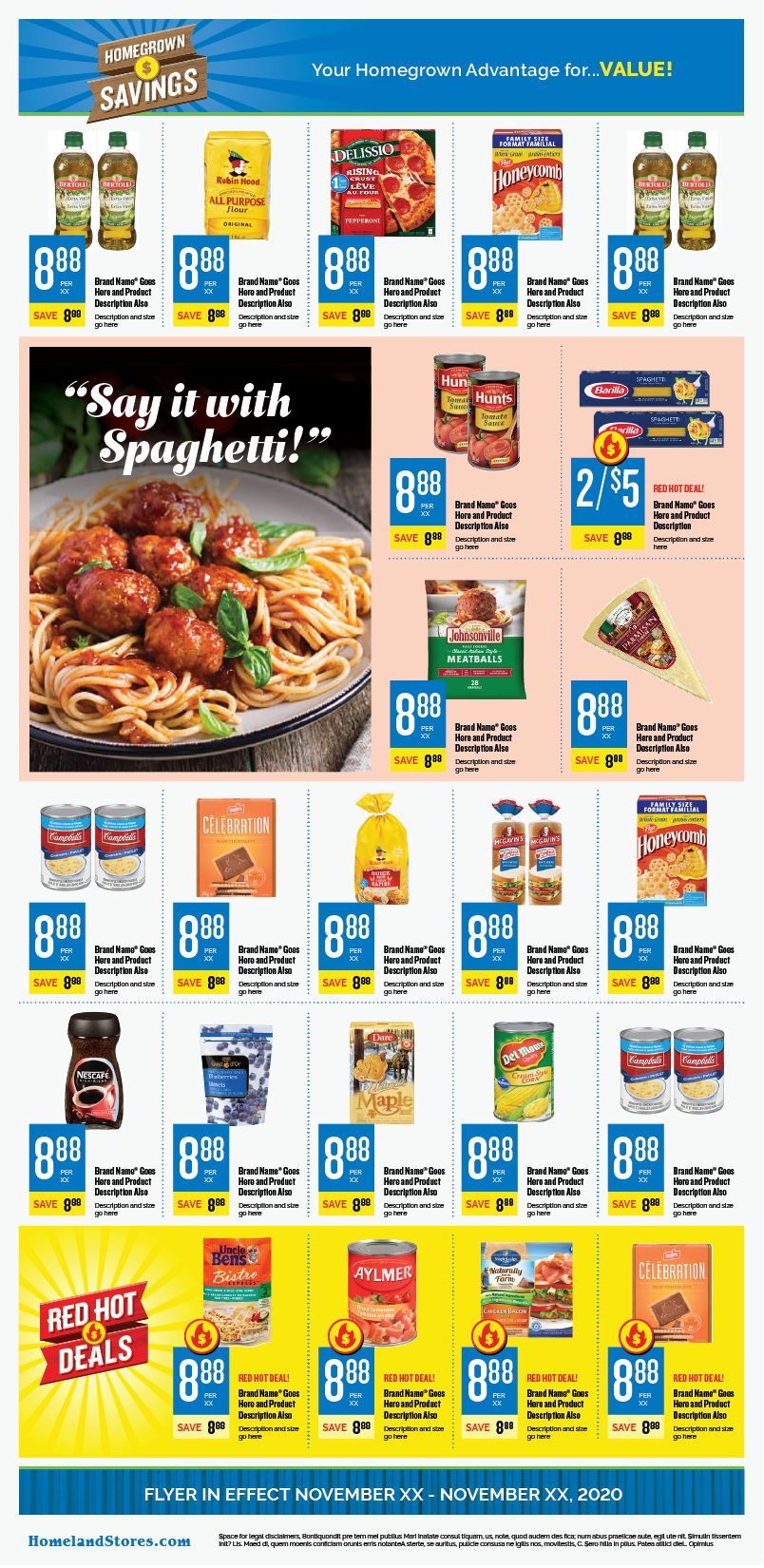
Price Program

Price Program Introduction
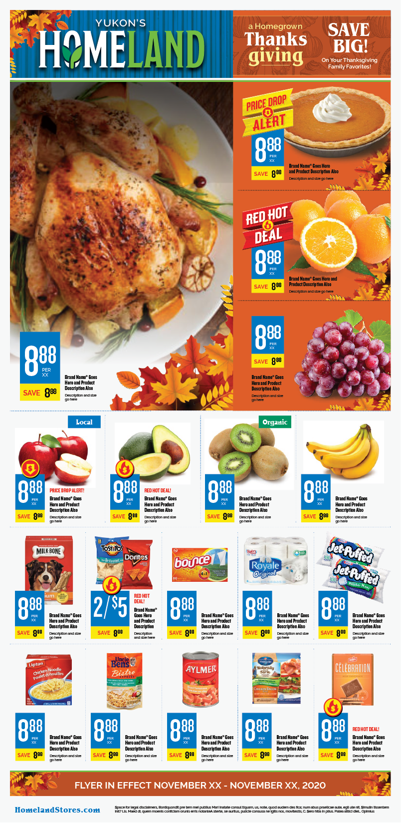
Flyer Grid - Cover
Flyer Grid - Inside
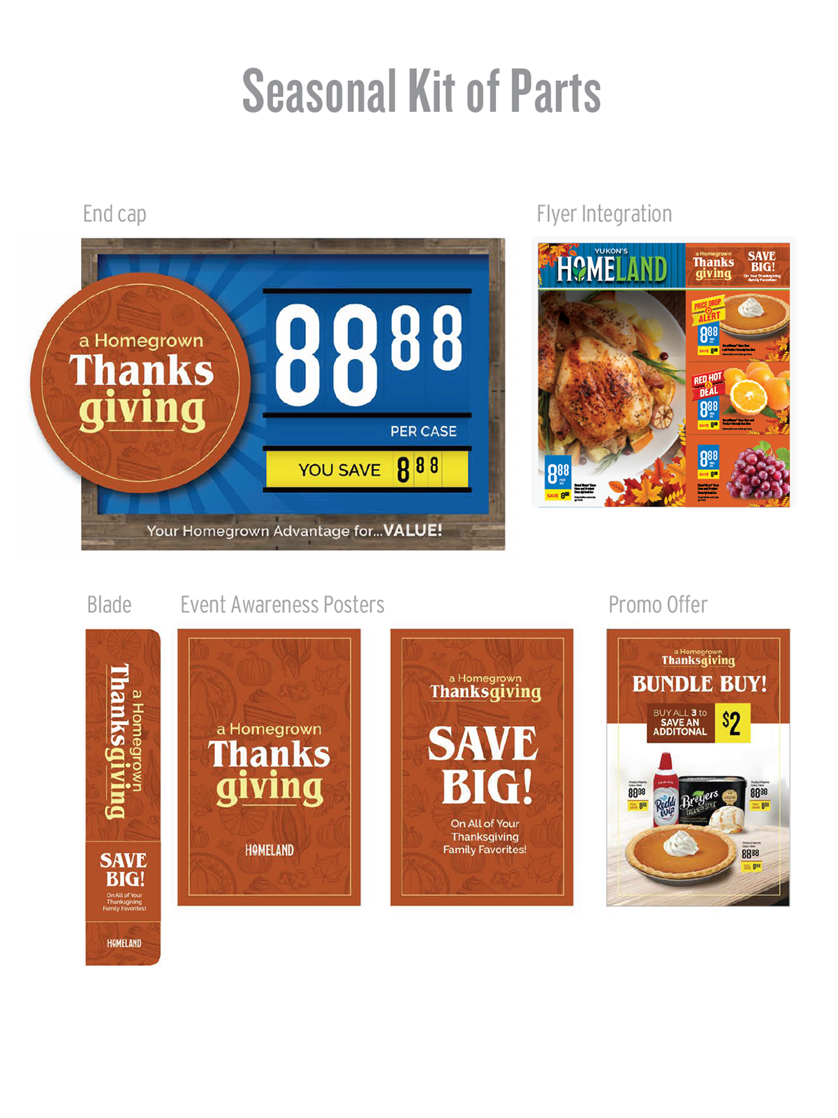
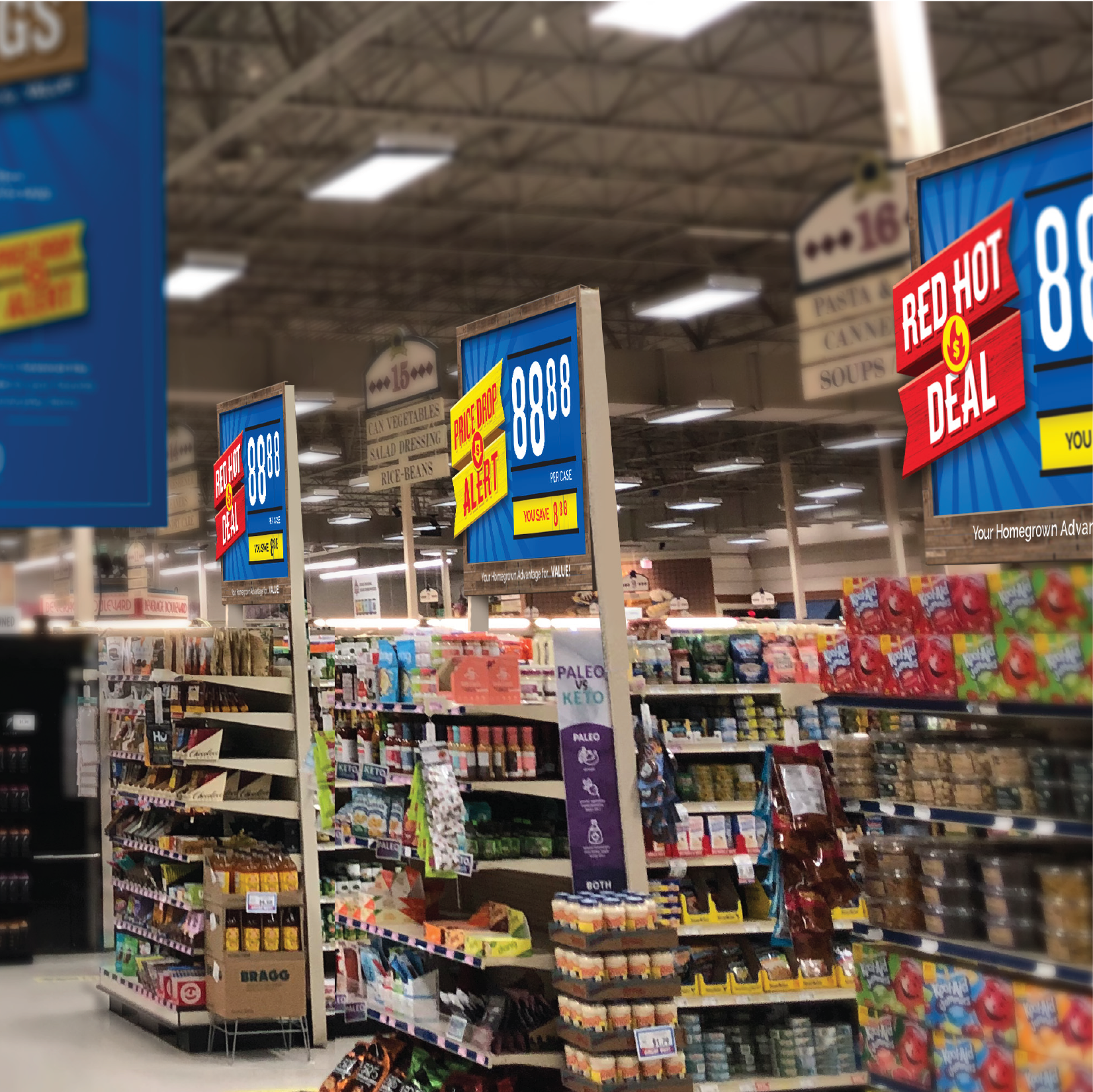
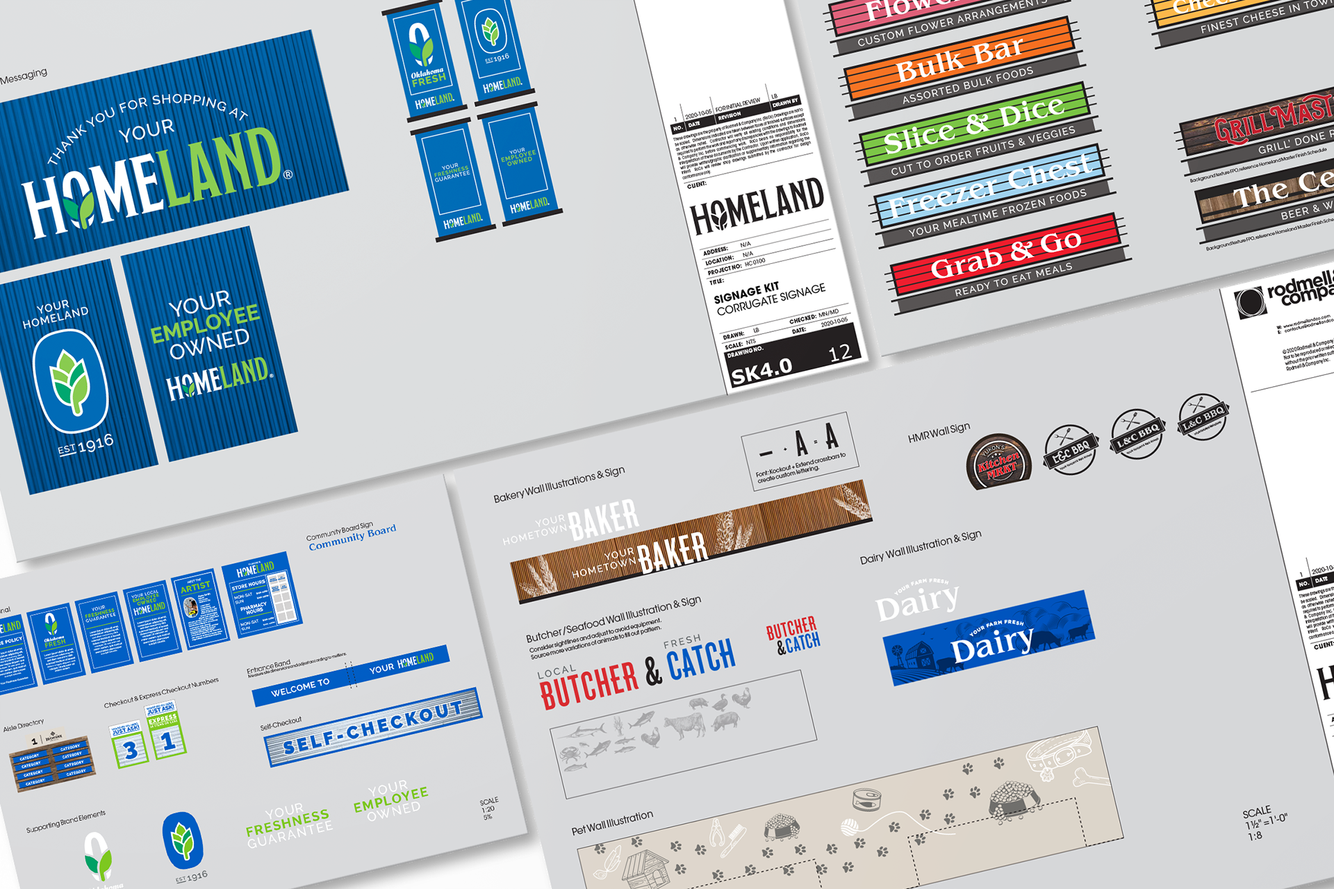
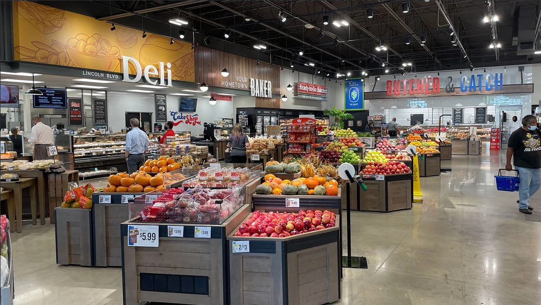
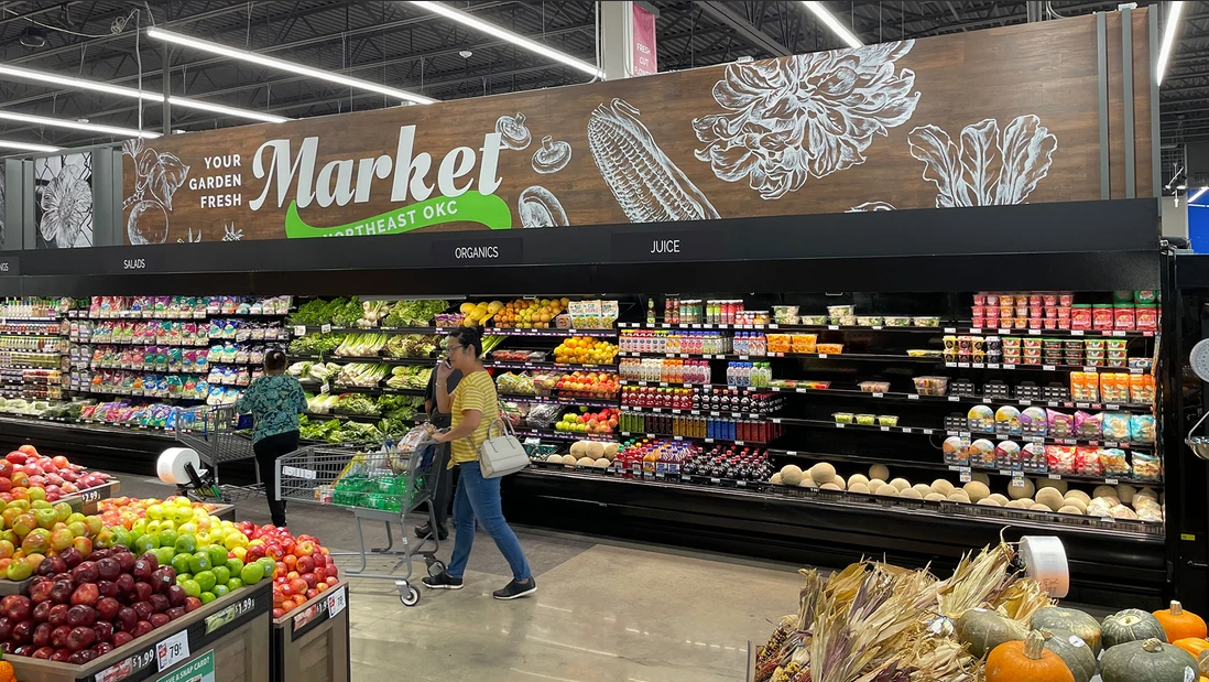
Store Signage
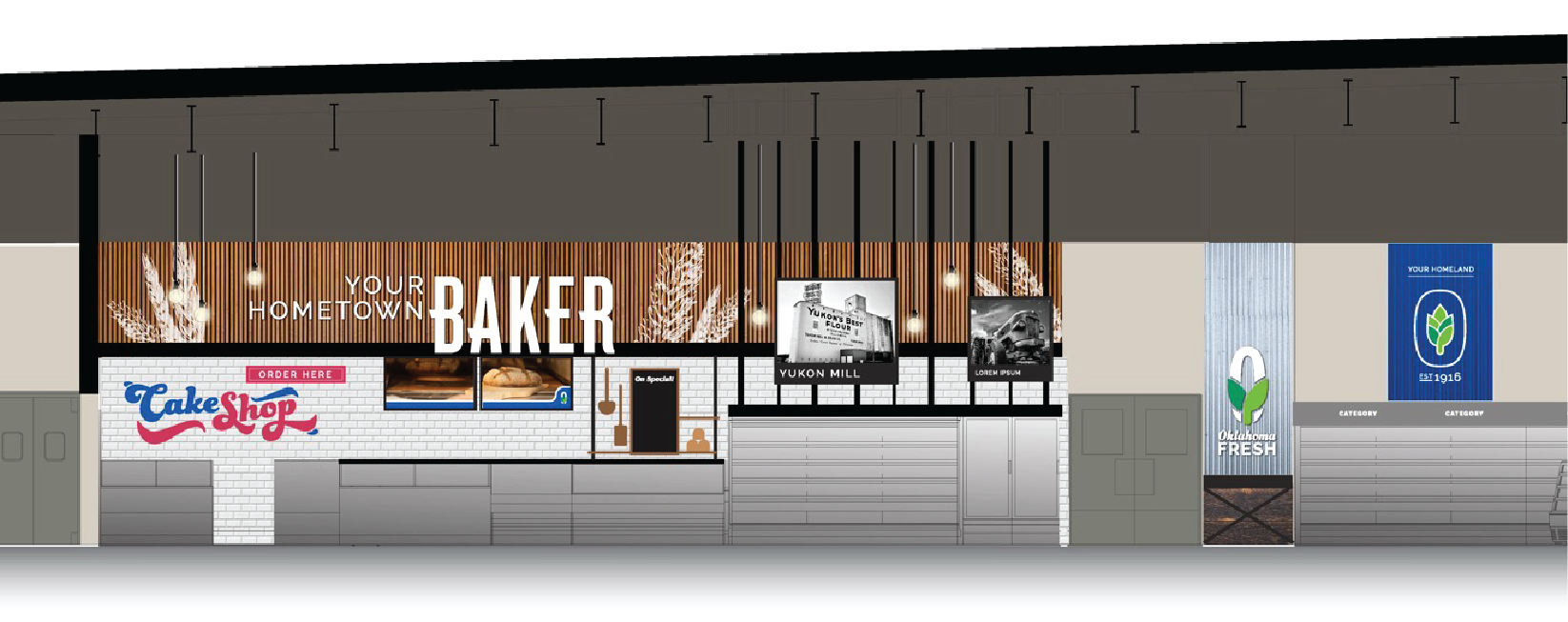
Graphics Placed in Elevation
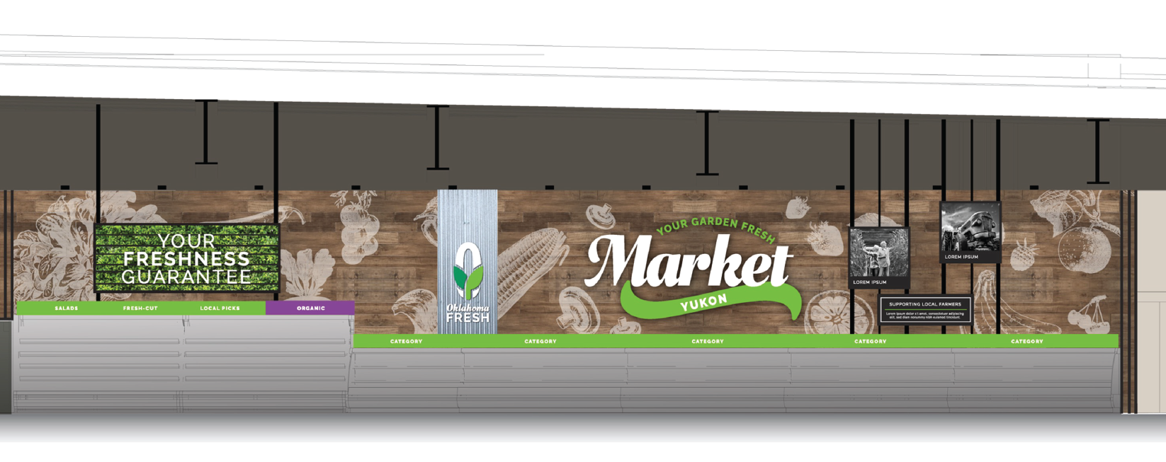
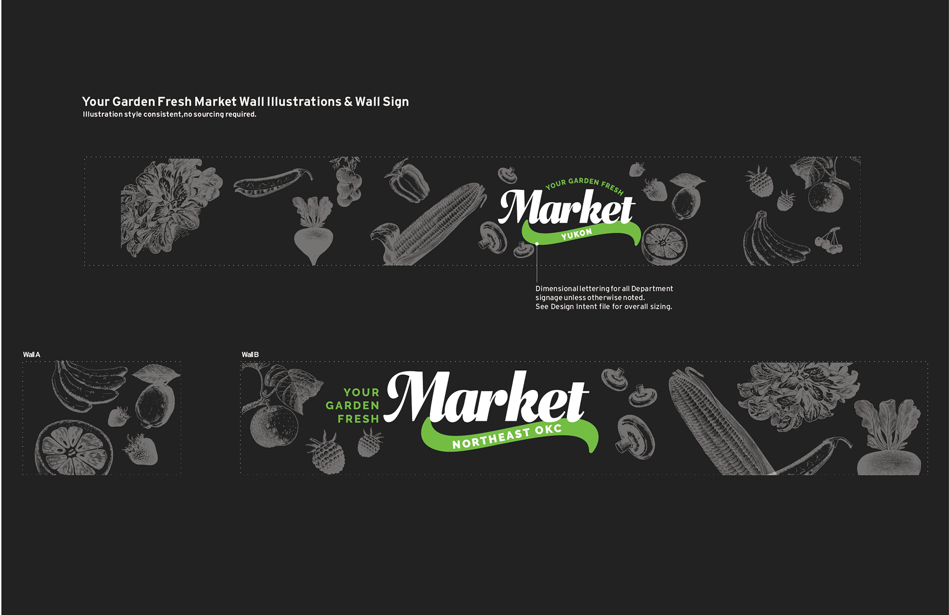
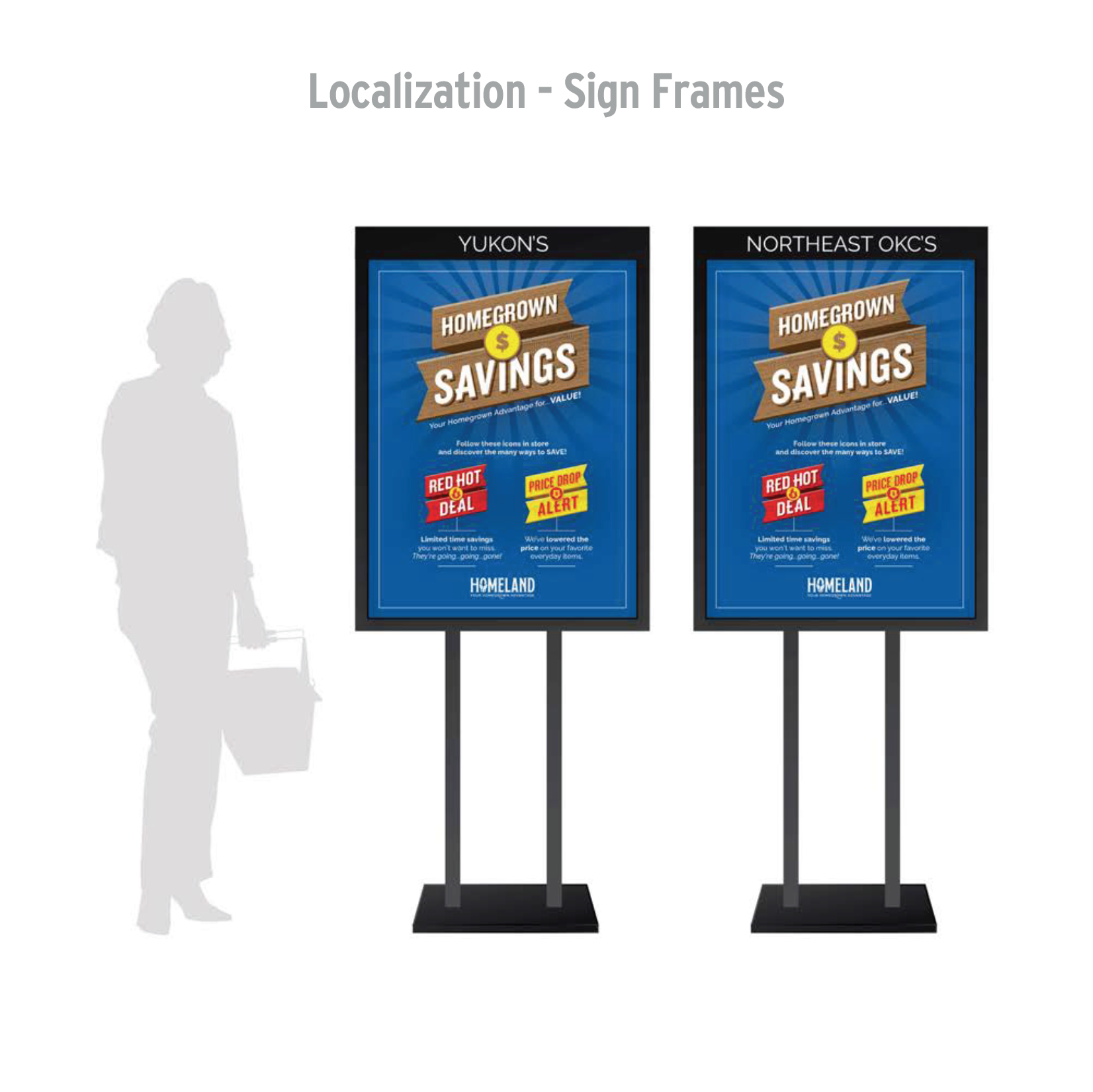
Store Location Adaptation
The Result
The rebranded Homeland Grocery opened to rave reviews, exceeding expectations and generating a 30% sales lift. The simplified price program improved customer clarity and reinforced Homeland’s commitment to providing everyday value alongside exciting, time-sensitive deals.
The new brand identity, signage, and promotional materials successfully positioned Homeland as a local, community-focused grocer while standing strong against regional competitors.

Creative Team — Rodmell & Company Inc.
Matt DeAbreu • Associate Creative Director & Brand Identity Designer
Designers | Luke Baulk & Corinne Su
Store Design | Denis McCutcheon
Executive Creative Director | Marcus Nilsson
Store Design | Denis McCutcheon
Executive Creative Director | Marcus Nilsson