Rebuilt. Reused. Refreshed.
Challenge
The Toronto Circularity Network had built a passionate community around circular practices in the built environment, but its brand was fragmented and lacked visibility. Content felt inconsistent, the identity didn’t convey authority, and the group risked being seen as a “talking shop” rather than a credible driver of systemic change.
Solution
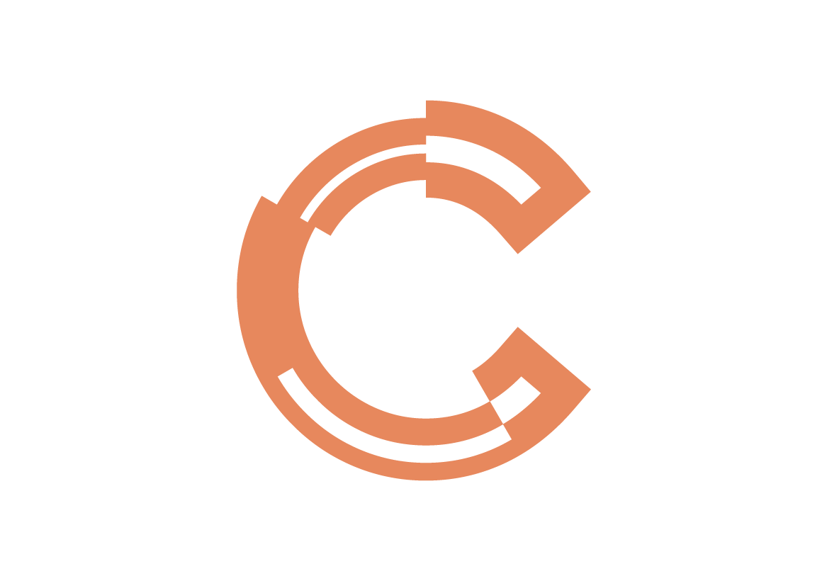
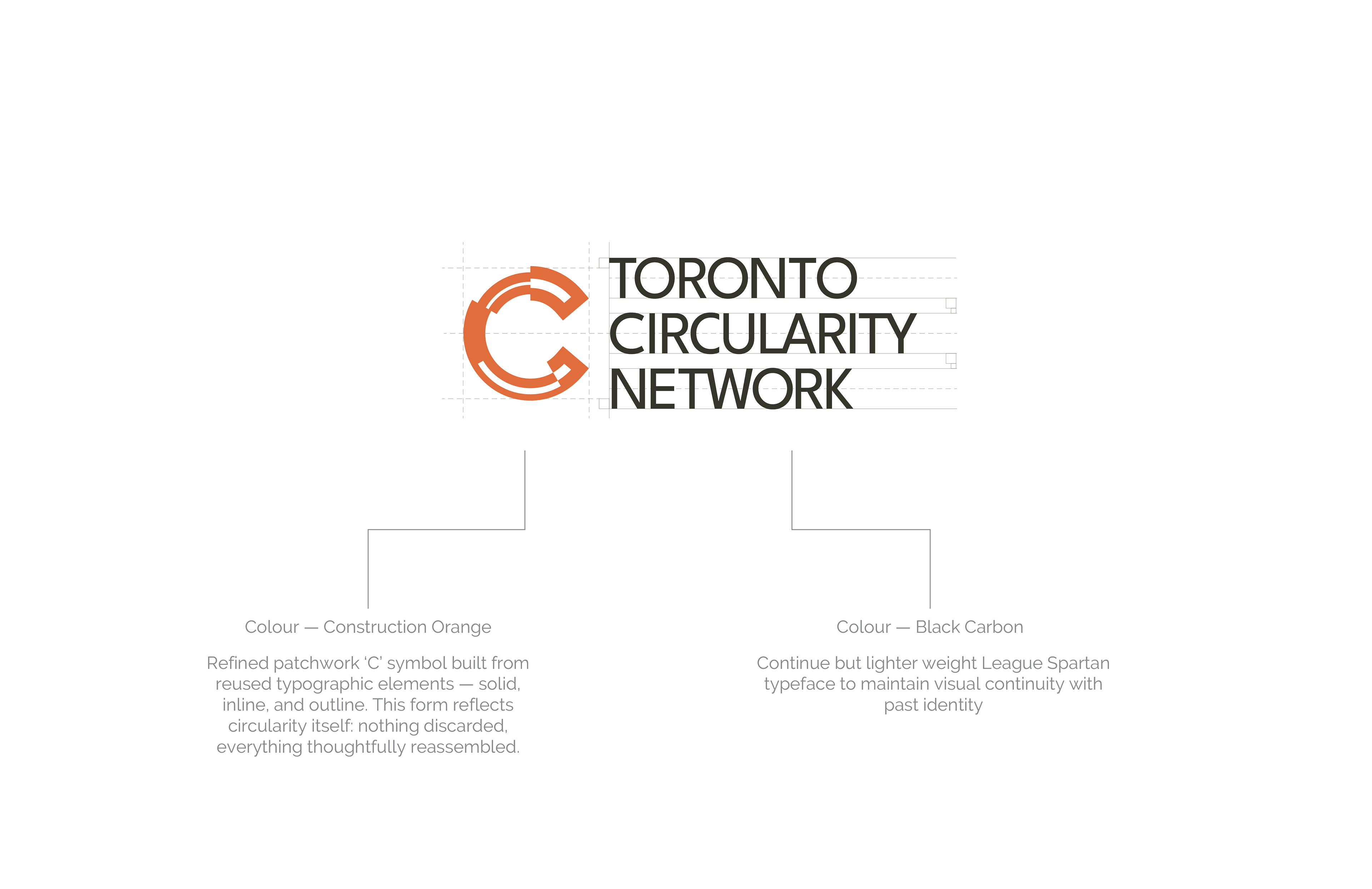
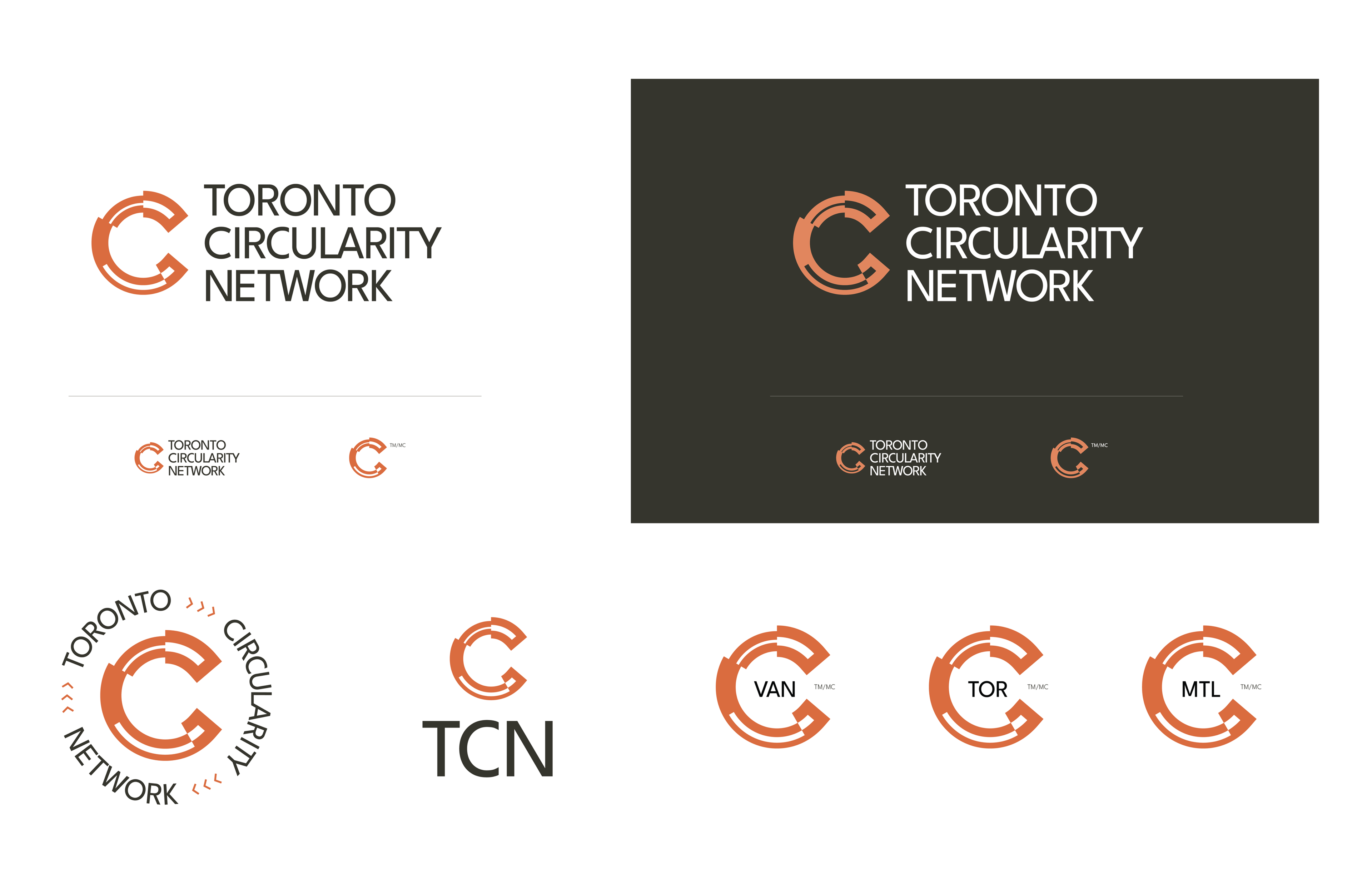
I led a brand refresh grounded in the belief that “Circularity is Second Nature.” This unifying idea reframed TCN as a connector of people, tools, and systems working toward resilience. From this foundation, I developed a series of logo concepts, then partnered with the group to refine the strongest direction into a distinctive patchwork “C” built from reused typographic elements. Paired with a functional type system from Google Fonts and a robust colour palette inspired by architectural and material cues, the identity balanced personality, accessibility, and meaning.
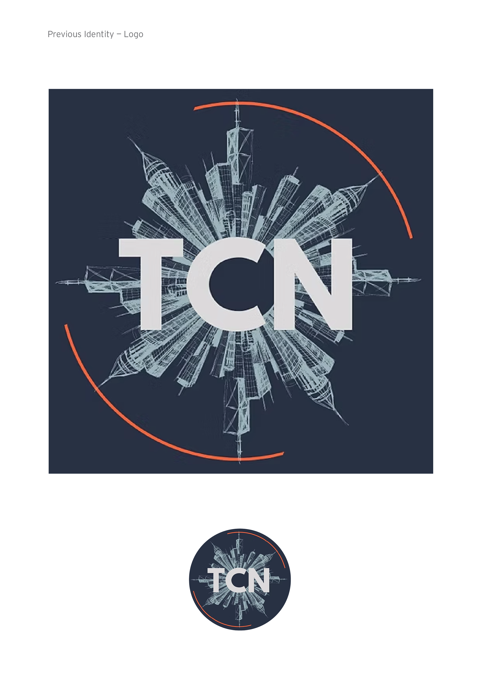
Previous Logo
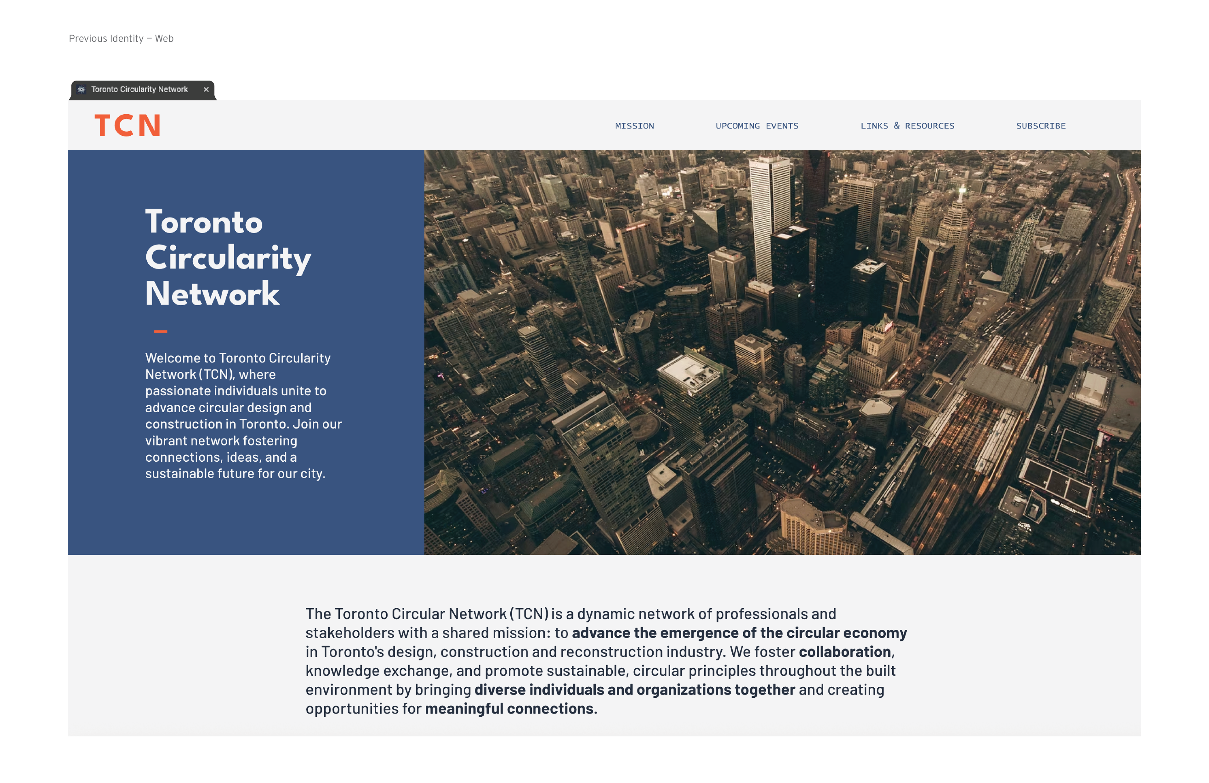
Previous Identity - Web
Identity Concepts
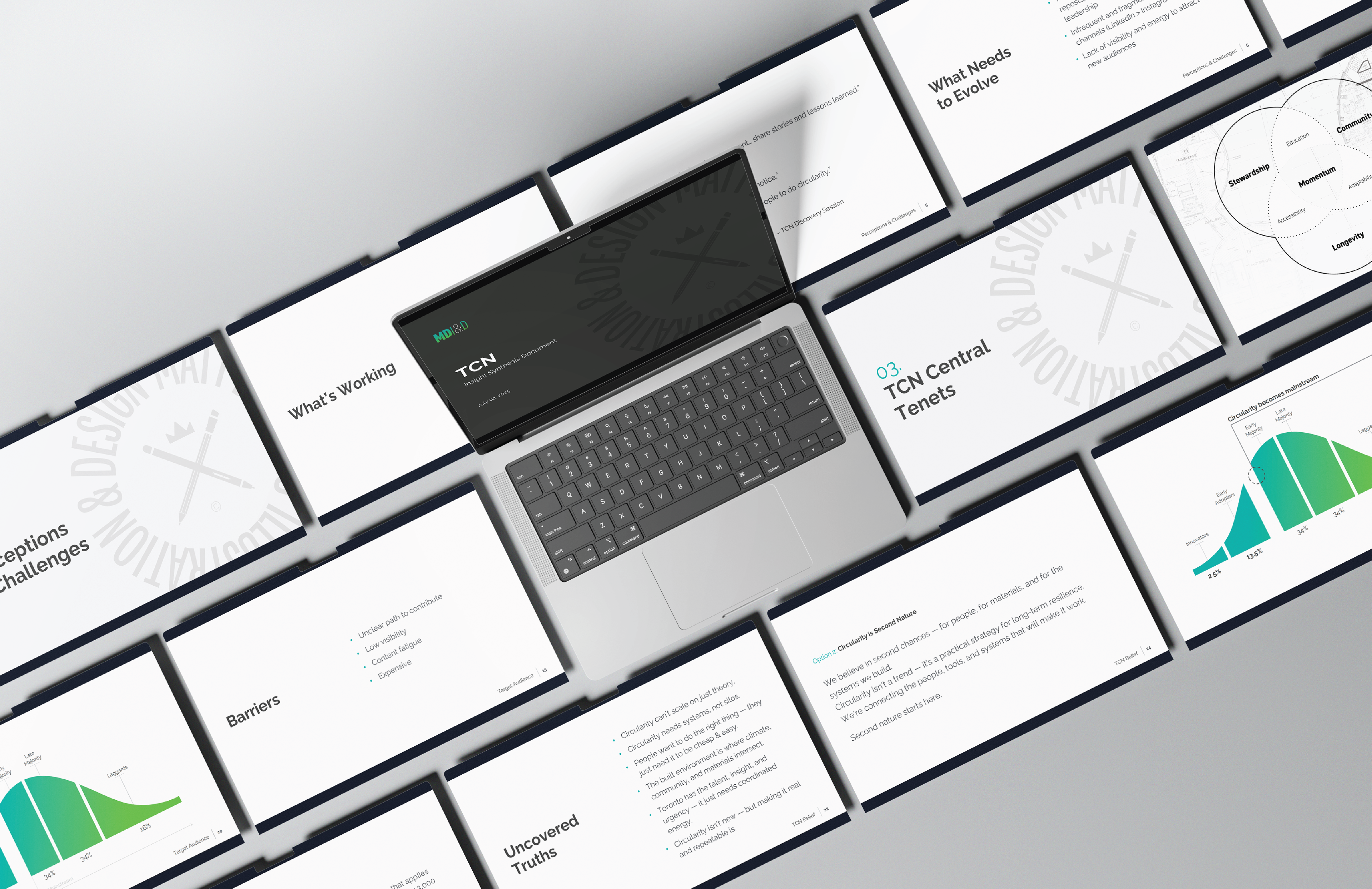
Brand Discovery Work
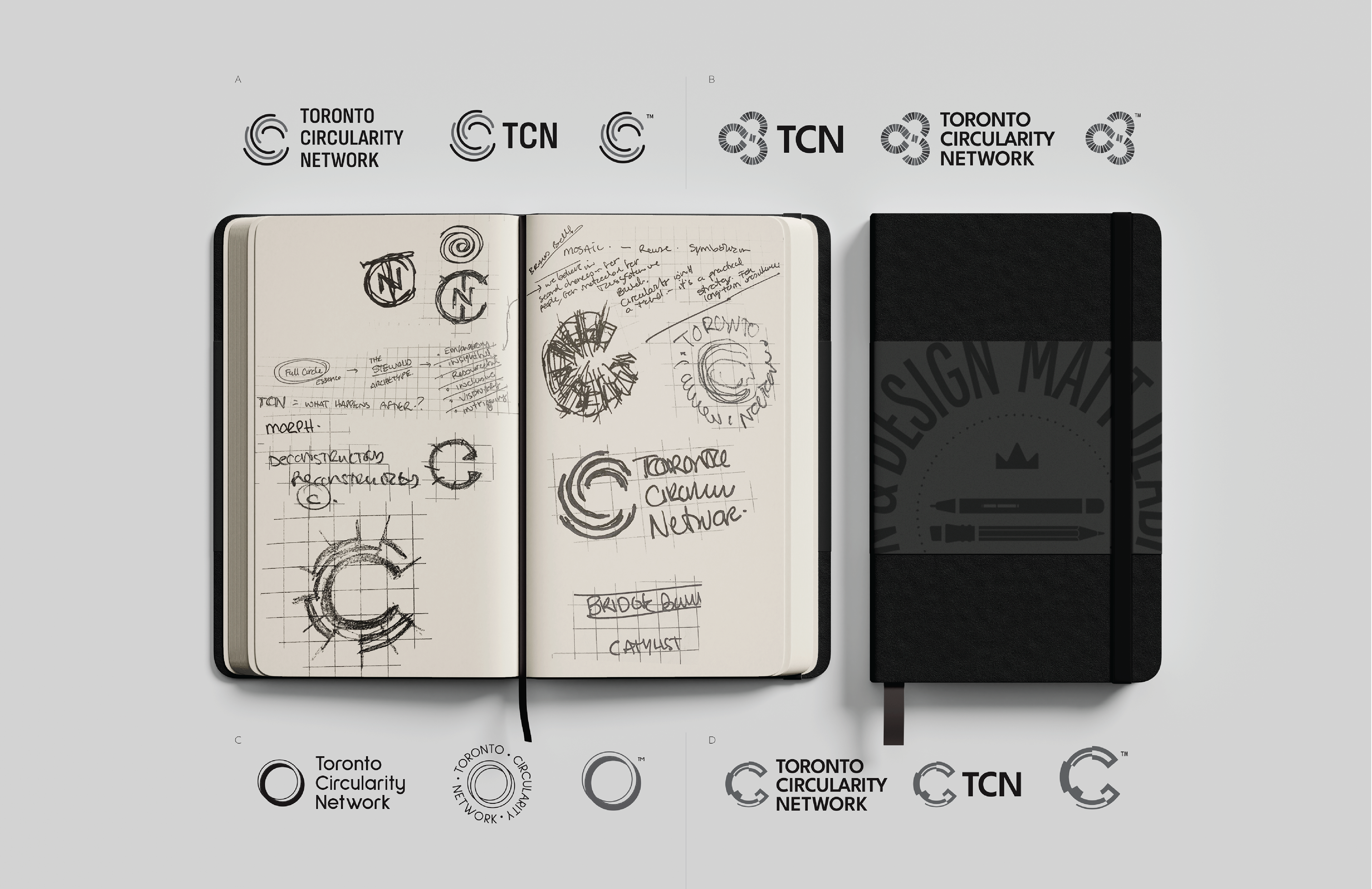
Initial Ideation
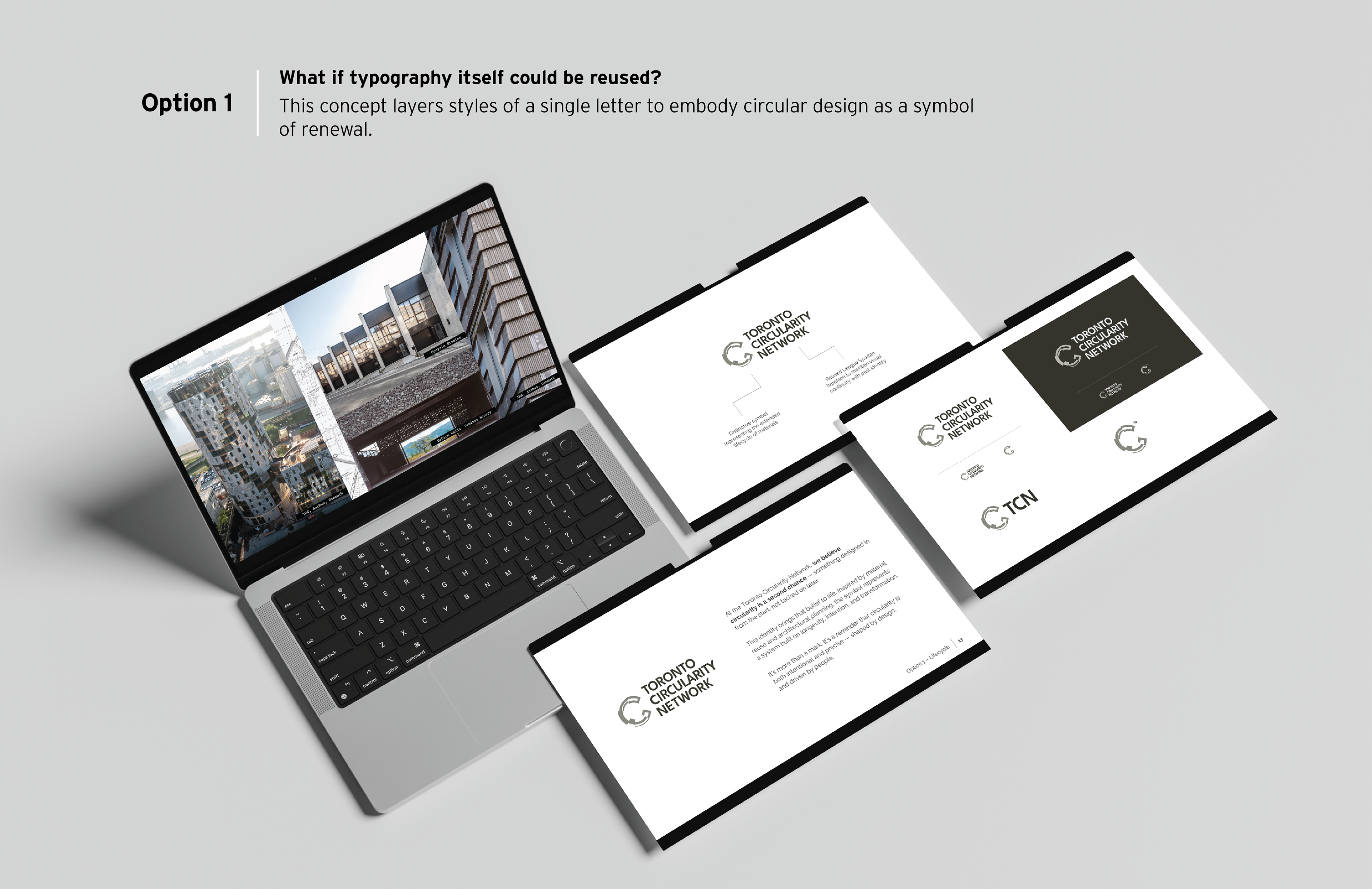
Option 1
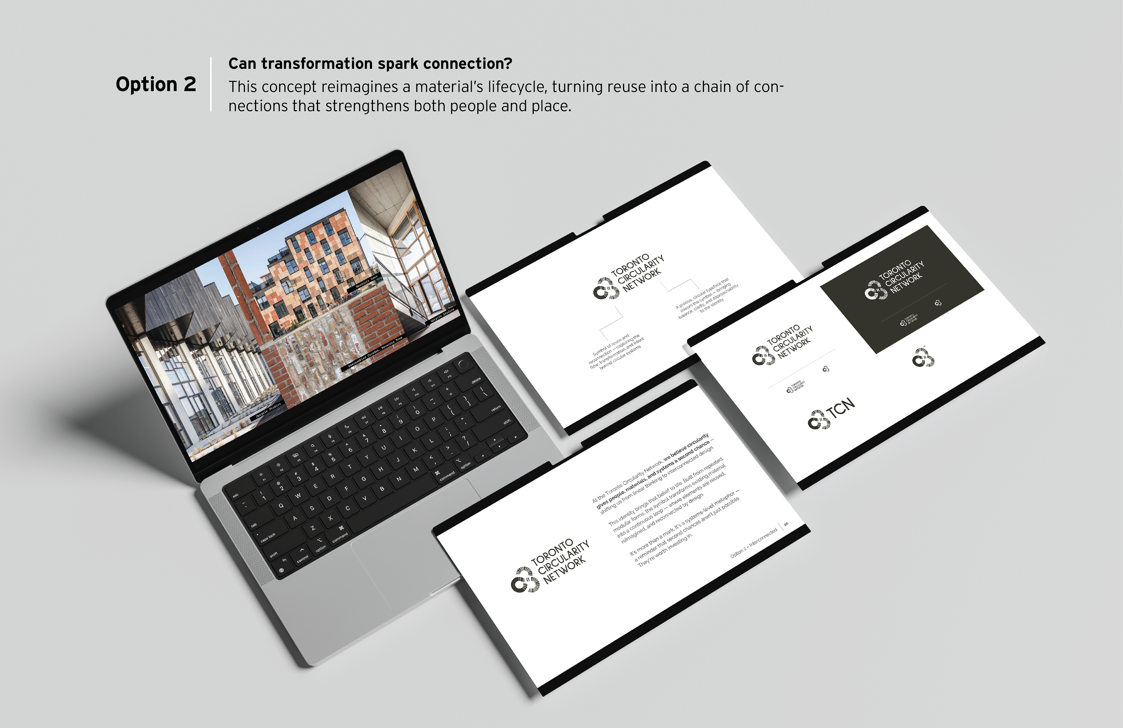
Option 2
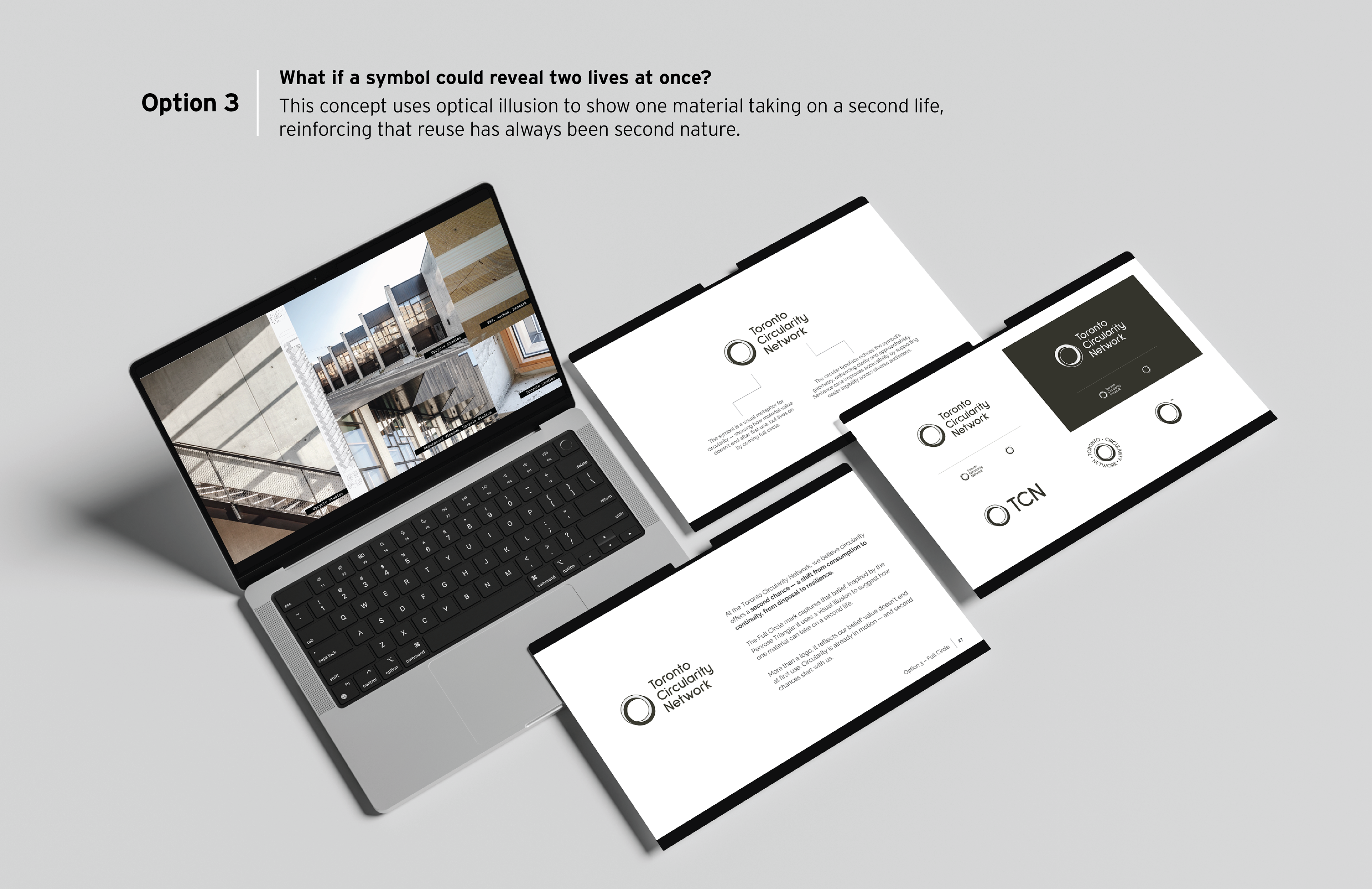
Option 3
Final Identity
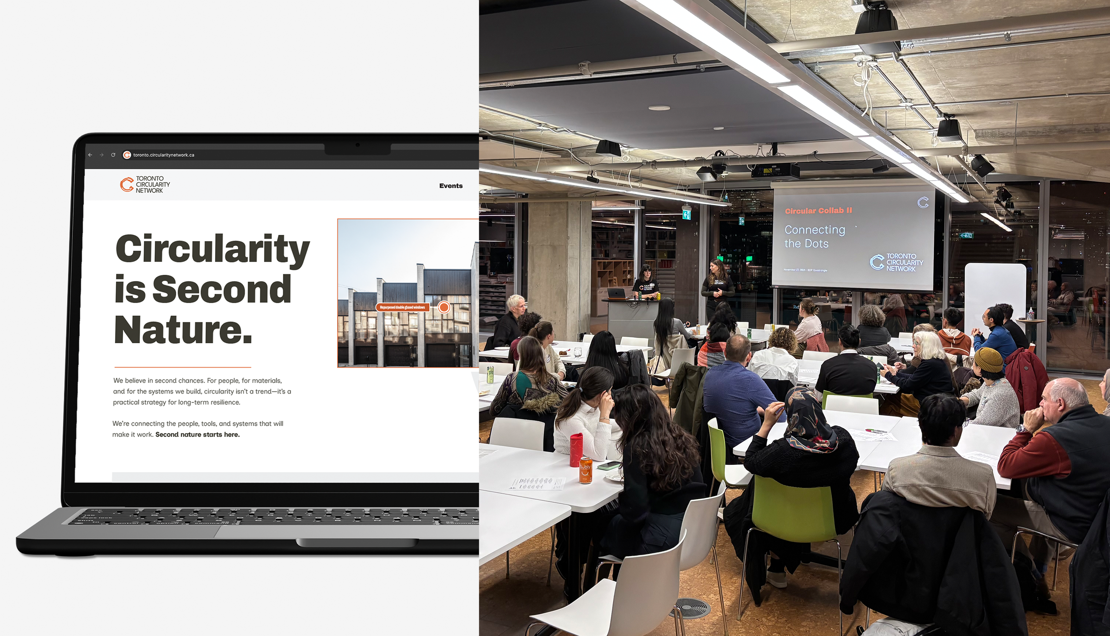
The Result
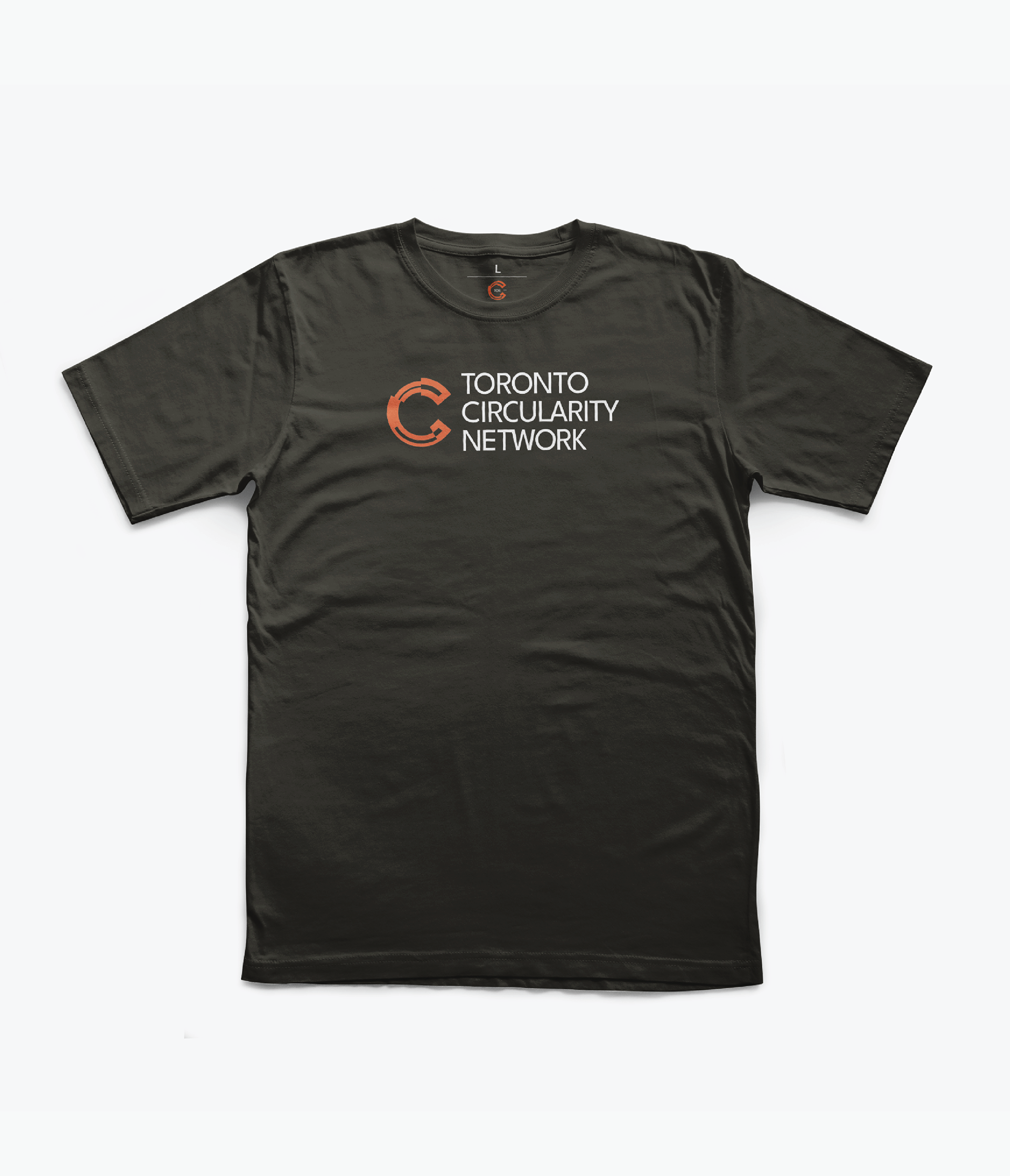
The refreshed brand transformed circularity from an abstract idea into a recognizable identity—built to scale across platforms and community moments.
“Circularity thinking is becoming mainstream in the design and construction community. Although our group started as a volunteer, do-it-yourself effort, we needed—and got—an identity that matches the impact we are having in helping drive this transition.”
— Alex Lukachko, Co-Founder, Toronto Circularity Network
— Alex Lukachko, Co-Founder, Toronto Circularity Network
Creative Team — Matt DeAbreu Illustration & Design Inc.
Matt DeAbreu • Principal Designer
TCN Founding Partners | Alex Lukachko & Breanne Belitski